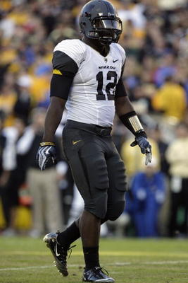
2010-2011 Nike Pro Combat Uniforms
-
OneBuckeye
 Looks like the released a photo of next years unis. Those thigh pads make me gag.
-
jordo212000
 Why waste the time and energy taking and releasing this picture? Everybody's unis are basically the same, save the silly raised logo on the pants...
 -
sjmvsfscs08Those look terrible. Nike needs to quit ruining everything, keep the new adventurous shit in Oregon, if it works there then expand it.
This makes me glad that Notre Dame's uniforms are made by Adidas and they don't fuck them up. -
Hb31187
 Uniforms are uniforms. Nike takes too long designing them, and people spend too much time bitching about them
 -
vdubb96^^^AMEN!
-
sleeper

They don't fuck up but they don't win many games with them either.sjmvsfscs08 wrote: Those look terrible. Nike needs to quit ruining everything, keep the new adventurous shit in Oregon, if it works there then expand it.
This makes me glad that Notre Dame's uniforms are made by Adidas and they don't fuck them up. -
j_crazy
 just so i'm clear is pro-combat a new style altogether, or a new material? I don't mind them changing the material, but i don't want to see teams adding tons of color schemes. Oregon has had some good ones but i'm to the point now where I don't care.
 -
3reppom

New materials.j_crazy wrote: just so i'm clear is pro-combat a new style altogether, or a new material? I don't mind them changing the material, but i don't want to see teams adding tons of color schemes. Oregon has had some good ones but i'm to the point now where I don't care. -
enigmaaxYeah, I caught a couple of the blurbs during games where they mentioned how lightweight everything is even down to the belt loop or something. The whole pitch is that you can maintain your natural speed and all that.
-
jordo212000
 The picture kind of looks computer generated... but I can't tell
 -
SageThey're the same unis.
#PhotoshopHustleAlert -
topwrestlerI gotta say, I don't mind them.
-
raiderbuckI highly doubt teams are going to go for those thigh pad designs. That's gotta be for marketing purposes only.
I gotta admit though. Mizzou's Pro Combat uni set was HOT!

-
End of Line
 ^^^^^^It did look pretty good.
 -
darbypitcher22
 Leave the goofy stuff to Oregon(although they've had some sweet color schemes that don't involve Electrict Yellow). I'm still giong on record as saying the stuff we wore against Michigan looked terrible.
 -
Hamp89Mizzou's were the best by far. The helmet is sweet.
-
jordo212000

Agreeddarbypitcher22 wrote: I'm still giong on record as saying the stuff we wore against Michigan looked terrible. -
Strapping Young Lad
 I'd like to see teams get a little more outgoing when It comes to the uni's...I love making different uni's for teams on video games. I also like how soccer teams sometimes have completely different color kits for road and away (example:Arsenal is red/white, but have blue and yellow kits). I'm a Colorado fan and they used to use blue and silver w/ the black and gold...So, I made a Blue and Silver alt. uni...
i'd like to see teams be more creative in real life...Oregon takes it to the extreme but somewhere in the middle would be cool... -
jspitaleri
 Those Missou helmets looked like someone forgot to paint the helmets and just left the primer on them. I think the logo on the thigh pads looks dumb, other than that the uniforms are ok.
 -
carolina55I kind of like the fact that nike's trying to make more modern uniforms, sometimes they jusy get a little carried away. Like last year's FSU Pro-Combat Unis were pretty awsome, but the TCU frog-skin pants were a little too far
-
jordo212000

The majority of the stuff they came out with this year has been garbagecarolina55 wrote: I kind of like the fact that nike's trying to make more modern uniforms, sometimes they jusy get a little carried away. Like last year's FSU Pro-Combat Unis were pretty awsome, but the TCU frog-skin pants was a little too far -
the_system
You've never seen flat black paint?jspitaleri wrote: Those Missou helmets looked like someone forgot to paint the helmets and just left the primer on them. I think the logo on the thigh pads looks dumb, other than that the uniforms are ok.


-
pkebkerAny pics of the Mizzou uni? I haven't seen it.
-
Scarlet_Buckeye
 Is it just me or do they pretty much look exactly the same as everyone's regular uniforms?!?
 -
Tiger2003
 pkebker wrote: Any pics of the Mizzou uni? I haven't seen it.